
If you’re looking to make your Shopify site mobile-friendly, there are plenty of ways to do it, but one way is to start out using a free Shopify theme designed specifically with mobile devices in mind.
In this post, you’ll find the best free Shopify theme for mobile devices that features a responsive design that will automatically adjust the layout of your Shopify eCommerce store so it performs well and looks great on mobile phones and tablets.
Table of Contents
Best Free Shopify Theme for Mobile
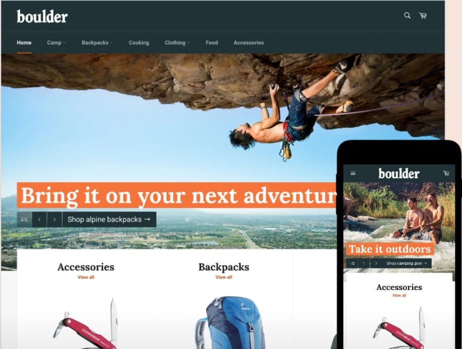
SuitUP – Fashion Store Free Elegant Shopify Theme
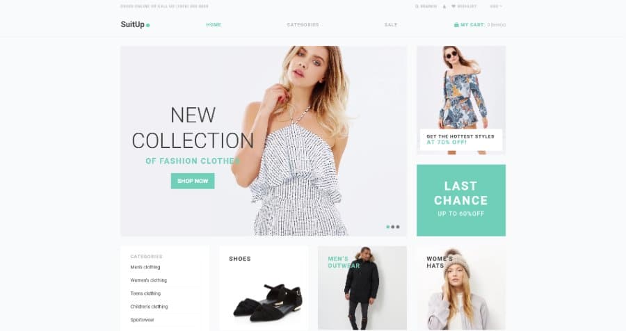
SuitUP is the best free Shopify theme for mobile. It looks great on all devices and has 7 ready-to-use templates that are sleek, modern, and responsive. You can also customize your website with advanced built-in theme options to help your site stand out from the crowd.
With SuitUP, it’s also extremely easy to set up your own dropshipping store in minutes since it’s fully compatible with Oberlo and Spocket (Learn More)
This is the perfect free Shopify theme for anyone who wants to build a mobile-friendly Shopify store without all the hassle of hiring developers or learning mobile design frameworks.
Click Here to Download SuitUP for Free!
Styler – Apparel E-Commerce Stylish Shopify Theme
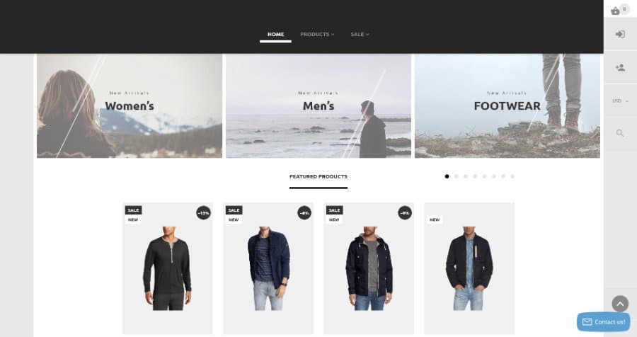
Styler is a highly responsive and easy-to-edit Shopify theme with tons of features that will help you create an amazing store in minutes! It’s perfect for fashion, apparel, or any other products.
With this theme, you can easily customize your site to match your brand’s look and feel with fully mobile responsive layouts. You’ll also be able to edit colors, fonts, images, and more without ever having to touch code! Plus it comes with advanced SEO features and it supports PPC marketing tools so you can take advantage of all the latest trends in eCommerce marketing.
And if you’re looking for some inspiration check out the Styler Demo site to see all of the premium features this free Shopify theme has to offer.
Diamond Rose eCommerce Theme
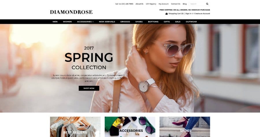
Diamond Rose is one of the best free responsive eCommerce themes. It’s easy to set up and customize your store in minutes with the integrated page builder. You can also create an online shop that matches your brand’s look and feel, without any coding knowledge required. Diamond Rose also has tons of features like an Instagram Feed, Parallax Scroll Effect, Sticky Menu, Dropdown Menu, and more!
With Diamond Rose as your eCommerce solution, you will be able to showcase all of your products in style on mobile devices or desktop computers with no fuss at all. Your customers will love browsing through your beautiful catalog with crisp menus, eye-catching banners, and quick navigation – it’s never been easier to build a free eCommerce store
The Diamond Rose eCommerce Theme is completely free, and you can run a Shift4Shop at no cost, unlike Shopify which will run you $29.99 a month.
If you want to build a completely Free Shift4Shop eCommerce Website (Click Here)
Venture Shopify Theme
Venture is the perfect free Shopify theme for large stores with lots of products. It’s responsive, mobile-friendly, and has 3 styles to choose from. The best part is that it’s officially supported by Shopify. And it features product details and large high-resolution images as well as slideshows, promotional banners, social media icons, and more. With all these great features and a ton of customization options available in the Theme Customizer, Venture will have your store looking like an online retail powerhouse in no time
Best Shopify Theme for Mobile
Huge Sale Shopify Theme
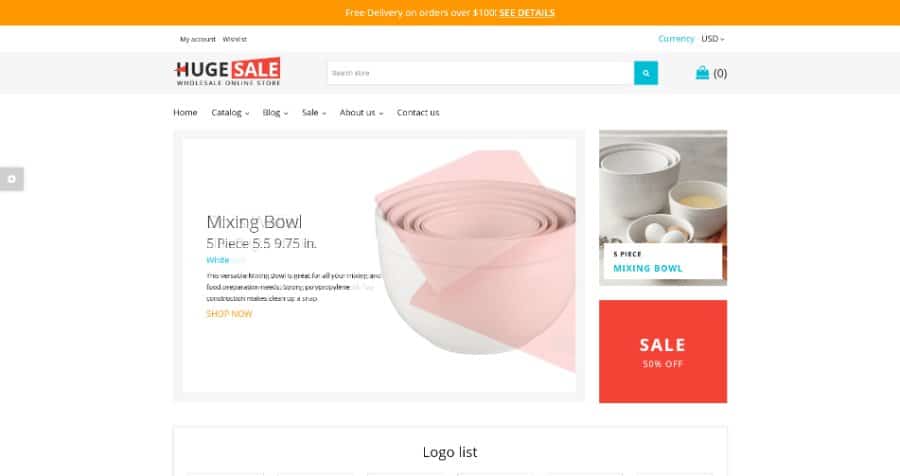
Huge Sale is a multipurpose Wholesale Warehouse Shopify Theme, which is suitable for online stores with a large inventory. There are two narrow banners in the topmost part of the template, where you can promote your sales and special offers with the help of countdown timers and call-to-action buttons.
The best thing about this Shopify template is that it has been designed to work seamlessly on any device, from desktop monitors to smartphones and tablets. You can adjust the layout of each page so that it looks exactly as you want it to look on every screen size without sacrificing its functionality in any way.
With its industry-leading performance and advanced options panel, Huge Sale makes it easy to customize every aspect of your store so that it matches the image you want to project while improving conversion rates and generating more sales.
StoreGo – Multipurpose Premium Electronic Shopify Theme
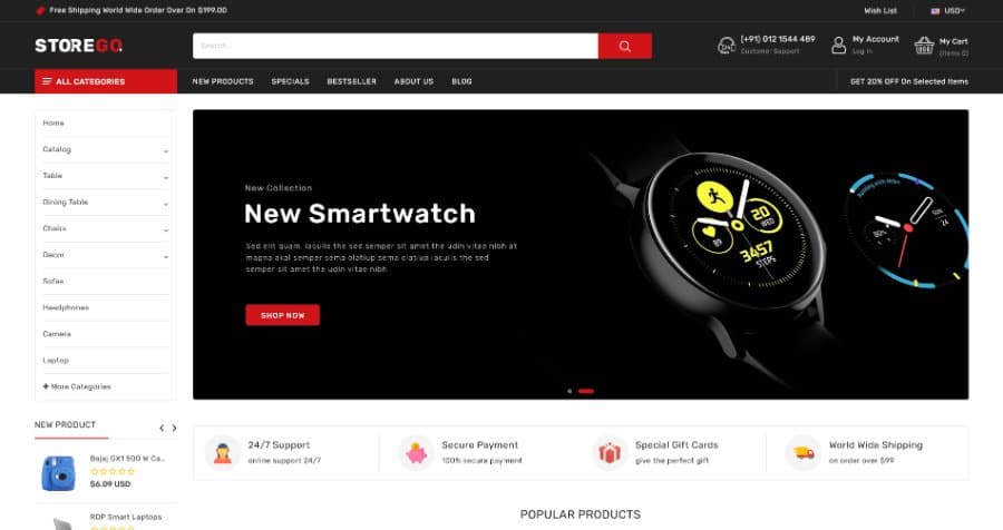
StoreGo is a Shopify theme that will help your store stand out from the competition. It’s beautifully designed and mobile-friendly, so customers can find what they’re looking for no matter what type of device they are using.
You’ll love how easy it is to customize this theme with the built-in advanced typography options. Upload your own font or choose from Google Fonts or Standard Fonts – whichever suits your brand best. The StoreGo Shopify Theme also features cross-browser compatibility for all types of mobile browsers on any device.
Craze – The Multishop Responsive Premium Shopify Theme
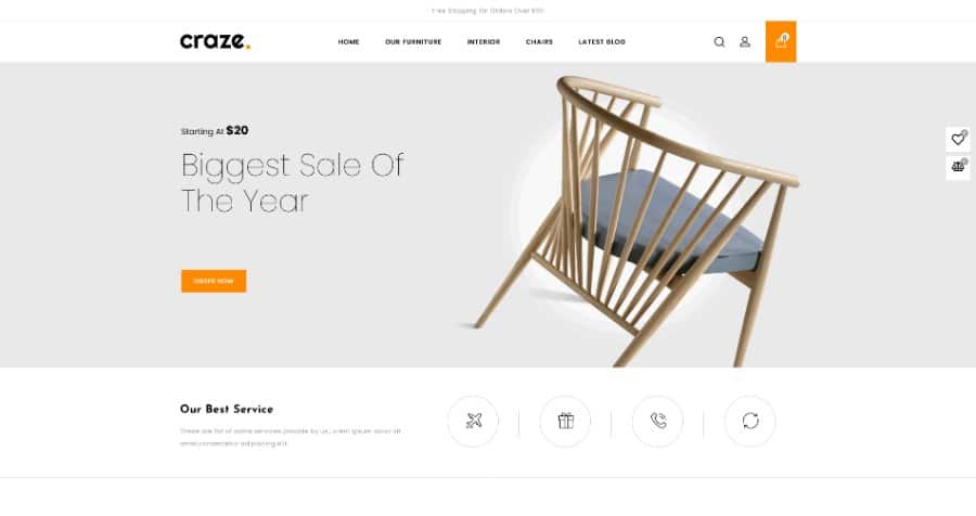
Craze is a powerful Shopify theme with a creative design. This theme features 3 premade layouts with different layout structures, styles, and colors that you can easily modify. Plus, with this theme, your store will be mobile-friendly right out of the box.
Craze is 100% responsive so it’ll look great on any device or browser size. You can also use Google Fonts to make your site more unique, and it’s SEO friendly so search engines like Google and Bing will send more traffic to the product listings on your site.
Craze has been designed by professionals who know what they’re doing when it comes to building mobile-friendly eCommerce stores. And the developers of this theme have already done most of the hard work for you, so all you need to do is install it on your shop and customize it to suit your needs.
Elessi 2.0 – Responsive Shopify Theme
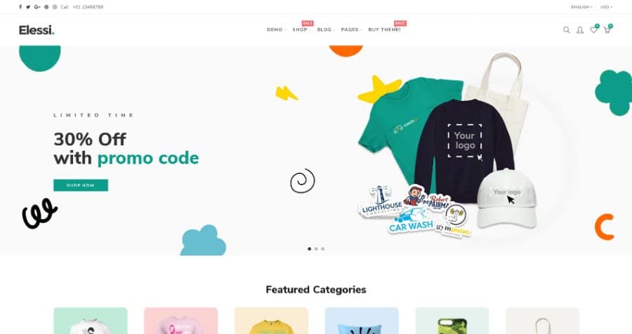
Elessi 2.0 is the best Shopify Theme on the Envato Theme Market. It’s been designed to be fully responsive and mobile-optimized, so your store will look great no matter what device it’s viewed on. This means that your customers can browse your products from their phones or tablet without any problems. Plus, this theme has tons of features like a drag & drop page builder and 360-degree product previews that make it easy to create an amazing-looking online store.
Belle – Clothing and Fashion Shopify Theme
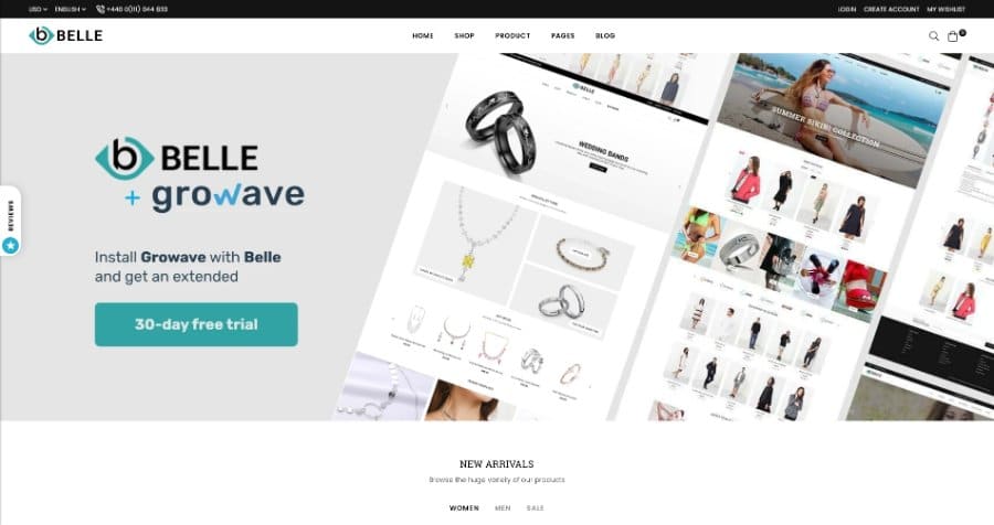
Belle is one of the best Shopify themes for mobile devices. It’s designed to be mobile-friendly, which means it will look great no matter what device your customers are using. Plus, it’s GDPR ready and optimized with Google PageSpeed so that your site loads quickly and looks beautiful on any browser or device. There are 10+ demo templates to start with that all feature a 100% mobile-responsive design, so even if your new to Shopify Belle makes it easy to build a great-looking mobile-friendly site.
Ayo – Multipurpose Responsive Shopify Theme
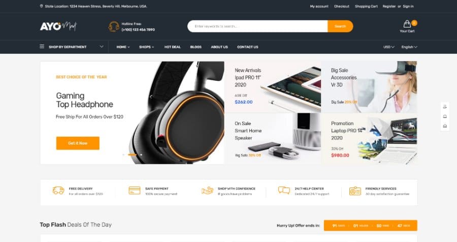
Ayo is the perfect Shopify Theme for any kind of store. It’s responsive, mobile-friendly, and has everything you need to create an awesome online shop. You can easily customize it with our drag and drop page builder or use one of the 6 pre-defined demo sites that are included for free when you download the Ayo Responsive Shopify Theme.
Goodwin – Ultimate Responsive Shopify Theme
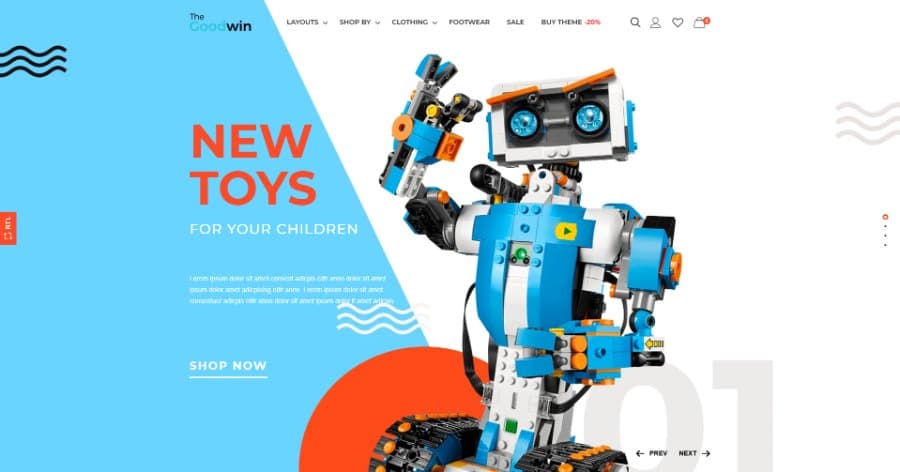
Goodwin is a unique multipurpose Shopify theme that can be used for any type of store. It will give you the best site administrator experience possible, and it’s fully responsive so your users will always have an amazing shopping experience no matter what device they are using.
Goodwin comes with 14+ ready-made Home page layouts and dozens of page templates including blog posts, product categories, etc. All of them are fully responsive so they look amazing on any device no matter if your customers are browsing on a smartphone or desktop computer.
Yanka – Fashion Multipurpose Shopify Theme
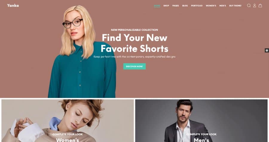
The Yanka theme is an affordable Shopify theme that’s fully mobile responsive. It’s a responsive, mobile-first website that uses Bootstrap 4 and includes 18+ homepage layouts. And you can choose from 9 product page variants or 25 collection page variants for your site.
With this theme, you’ll be able to create a beautiful online shop that will work on any device – desktop, tablet, or phone! Plus there are so many different templates and options available that you’re sure to find one that’s perfect for your needs.
Shopify Mobile App Builder
The Shopify Mobile App Builder lets you build an app in minutes. You don’t need any design or development skills, just upload your logo and add some text and images. The intuitive drag-and-drop editor makes it easy for anyone to make a beautiful mobile app that looks great on all devices.
With the Shopify Mobile App Builder, you can easily create an iOS or Android mobile app for your own brand using the same platform that tens of thousands of businesses around the world already use to manage their online stores.
Shopify Mobile Speed
Shopify merchants are suffering losses due to slow page load times.
Page speed is a ranking factor in Google search results, and it can directly affect your bottom line.
The Shopify Mobile Speed Optimizer will instantly improve the page load time for mobile devices that visit your store by implementing several techniques such as minifying CSS/JS files, combining CSS/JS files, optimizing images for the web, and much more!
You can also use this plugin together with free tools to analyze the performance of your Shopify website or app to help narrow down performance issues.
Shopify Mobile Optimization
A mobile-optimized Shopify store is a huge advantage for any entrepreneur. This will help you gain more traffic, leads, and sales with your online store.
Fixed Navigation
Having a fixed navigation bar on the top of your website ensures that people can scroll through your products and see everything you have to offer without having to scroll back to the top of your site to navigate your store.
Mobile-Friendly Images
Do you want to speed up your site? One of the easiest ways is by using mobile-friendly images.
Mobile devices like smartphones and tablets are getting more popular, so it’s important that your website focuses on the limitations of these devices.
You can do this by uploading smaller-sized images for your product listings and other supporting content. This will not only increase page load time, but it will also allow people to visit your store without killing their battery or maxing out their data plan.
Shorter Paragraphs
As smartphone screens get smaller, it becomes increasingly difficult for users to read long product descriptions. Readers of mobile devices typically scroll vertically down a page instead of reading horizontally from left to right, which means that paragraph lengths must be shorter in order to avoid a poor user experience on mobile phones.
Improve Your Call to Action Buttons for Mobile Users
It’s becoming increasingly important to ensure your site is responsive and easy-to-use for those customers browsing from devices like smartphones or tablets.
One thing you can do to improve conversions that is often overlooked is making buttons larger, so they’re easier to tap on smaller screens
Conclusion
Every business needs to be able to quickly and efficiently reach their customers, no matter where they are. Your shop should reflect your brand’s identity on every device so that it can seamlessly transition between desktop screens and mobile phones.
We created this post with the goal of helping you find the best Shopify theme for Mobile devices as well as providing some tips on how to optimize your storefront for a seamless experience across all platforms.
We hope you found the best free Shopify theme for your business, and that you learned a few things about improving your Shopify store’s mobile performance.